


JADE LEAF
Logo & Brand Design 2015
OVERVIEW
Jade Leaf is a Vietnamese eatery and lounge that serves lunch and simple finger foods for dinner. The restaurant will soon open and is located in downtown San Jose, California. The owner of this business asked me to create the restaurant’s logo.


DESIGN PROCESS

Brainstorming
Conceptualizing
Client discovery
Industry discovery
Application discovery
Typeface
Color scheme
Client requirement
Client feedback
Supply files to client
DESIGN BRIEF
The client provided me with some key phrases to describe her restaurant: “Vietnamese fusion,” “simple,” and “fast and delicious.” My mission was to create a logo that would reflect these key phrases.
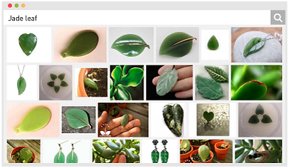
RESEARCH
I began the project by searching for and analyzing the logos of other restaurants in the San Jose area. I looked up images that popped up after entering key phrases such as “Vietnamese fusion” and the name of the restaurant and began to brainstorm ideas for the logo.

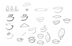
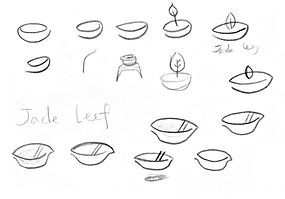
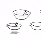
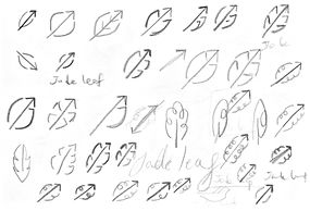
SKETCHING & CONCEPTUALIZING
Based on my mission and research, I ideated solutions by sketching as much as possible. I mainly experimented with ideas involving shapes of leaves or bowls. I also thought about including the initials of the restaurant, “J” and “L,” into the logo. I narrowed down the possibilities by selecting what I thought to be my best ideas and then computerized those ideas.


COMPUTER GENERATION
After computerizing my best ideas, I thought to myself, “What’s more fun than an optical illusion?” Well, probably many other things. But I reasoned that optical illusions are intriguing and often capture a person’s attention. Thus, when it came time to choose just one idea, I decided to go with my optical illusion idea. At first, the logo might look like a bowl with a pair of chopsticks. Yet, from a different angle, it also looks like a leaf!


Bowl or Leaf
Chopsticks or Veins of the leaf
Food or Shade
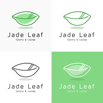
TYPEFACE
Given that Jade Leaf was going to be a new restaurant, I decided to have the logo be a combination mark (a combination of the logo and the name of the restaurant) that is ideal for new businesses. I experimented with various typefaces and ultimately chose Maven Pro, a san-serif typeface with a unique curvature and flowing rhythm, for “Jade Leaf,” the restaurant’s name. I then chose Letter Gothic, a monospaced sans-serif typeface, for the subtitle, “Eatery & Lounge,” below the restaurant’s name.


COLOR SCHEME
I selected a jadish green color as the logo’s dominant color to have the color match the name of the restaurant. For simplicity and elegance, I had other colors in the logo be different shades of green.
Applied to the Logo
Dominant Color
Base Color
Assort Color
or Accent Color


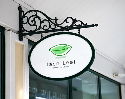
FINAL DESIGN
LEARNINGS
I Liked Given that this was my first paid professional work after graduating from college, I learned more about the real world aspects of being a professional designer, such as copyright law.
I Wonder If the logo’s design would have changed had I had the opportunity to taste the restaurant’s food before beginning the design process.